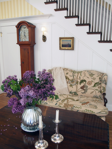
Early American Style
Colonial Amercians drew inspriation from their European heritage. Curent design styles would filter across the ocean and become reinventedin early America. Proportion and scale took reign over ornementation, A neutral color palette of grey blue, greens and rose pinks is readily apparent.
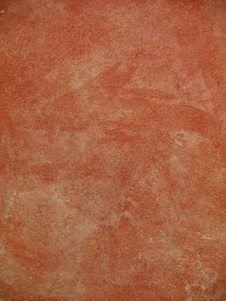
Stucco Rustico - Aged Plaster
Stucco Rustico is a Traditional interior and exterior textured plaster that epitomizes the rustic old world charm commonly associated with Tuscan environments. I love this treatment for its ease of application and the natural, organic glazed appearance that results when using mineral based plasters and glazes. Whether a rough application or a smooth finish, this treatment holds true to the test of time and, in fact, feels as if time itself stopped to wash the walls personally.
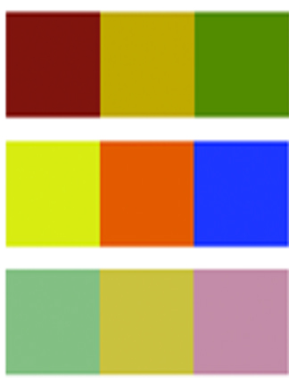
The Rustic Color Palette
The Rustic Style color palette falls within a distinct range of color tones and is essential in creating a successful Rustic interior. By using the appropriate color tones you can create a variety of design styles ranging from Period and Historic, regional or thematic. Color helps define our experiences within an interior and exterior environment. It affects us on a physical, emotional, and spiritual level and can be calming and passive, expressive and vital.
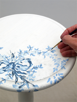
Painted Floral Details
Floral patterns used as accents in fabrics and furniture are common place details in the English Country home. These graceful and organic patterns complement the cozy interior of this style and work particularly well with lace window treatments, an heirloom tea service set and the natural and rustic charm of wooden ceiling beams and slightly irregularly textured walls.