Complementary Color Schemes
Bold and Vibrant Design
If you're looking to make a bold statement in your space, using a complementary color scheme is a great way to achieve vibrant and exciting results. Complementary colors are those that sit opposite each other on the color wheel, such as blue and orange, purple and yellow, or red and green. When these contrasting colors are used together, they create a dynamic and lively atmosphere, making your space pop with energy.
Understanding Complementary Colors
Complementary colors work by enhancing each other’s intensity. When placed side by side, they create strong contrast and make each color appear more vivid. This is why complementary color schemes are often used in modern, eclectic, and bold designs where high visual impact is desired. However, balance is key—too much contrast can overwhelm a space, so it’s important to apply these colors thoughtfully.
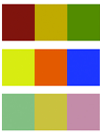
Examples of Complementary Color Pairings
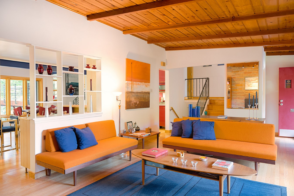
- Blue and Orange: This pair creates a cool yet energetic vibe. Blue brings a sense of calm and depth, while orange adds warmth and excitement. It’s a perfect combination for a modern living room or a playful dining space.
- Purple and Yellow: These colors create a bright, cheerful atmosphere. Yellow’s brightness enhances purple’s richness, making this pair ideal for spaces where you want to combine elegance with a touch of vibrancy.
- Red and Green: While often associated with the holiday season, red and green can be used in a contemporary way to add boldness and freshness to any room. This pairing works particularly well in kitchens or creative spaces.
How to Use Complementary Colors in Your Design
When using complementary color schemes, it’s essential to balance the intensity of the colors. Here are some tips for successfully incorporating complementary colors into your design:
- Choose a Dominant Color: Pick one of the complementary colors as the main color for larger areas, such as walls or floors, and use the opposite color for accents, furniture, or decor items.
- Use Neutral Tones: Complementary color schemes can be intense, so adding neutral tones like white, gray, or beige can help soften the look and create a more balanced, harmonious space.
- Play with Saturation: If the boldness of true complementary colors feels too overwhelming, try using lighter tints or deeper shades of the colors for a more subtle and sophisticated effect.
- Accessorize with Complementary Colors: If you’re not ready to commit to painting walls in contrasting colors, start by introducing complementary colors through accessories like throw pillows, rugs, artwork, or curtains.
Perfect for Modern and Eclectic Spaces
Complementary color schemes are ideal for modern and eclectic spaces that thrive on bold, creative designs. They bring energy, contrast, and excitement to a room, making them a popular choice for those who want to add personality and vibrancy to their home. By using these colors thoughtfully, you can achieve a balanced yet dynamic aesthetic that stands out and makes a lasting impression.
Incorporating complementary colors into your design can completely transform your space. Whether you’re looking to create a striking modern look or an eclectic mix of styles, complementary color schemes offer endless possibilities for bold, vibrant design.

Selecting Colors
How to choose, what choose?
Mixing with color
Color is DESIGN. Create it, Own it!

Pre-mixed Glazes
Ready, set, GO!
Getting going with these premixed glazes. Select one of our pre-mixed glaze colors or create your own. We custom mix any color from all major paint manufacturers. Just pick your own color from any swatch book and let us know the paint name and number and we'll send you the right glaze - interior or exterior - custom matched to your liking.
Create classic effects such as colorwashing, dragging, striee, antiquing effects, furniture effects and much more!
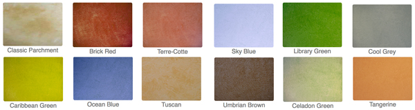
Color Palette
TIPS
Look for neutrals. Understanding a few simple color principles can result in successful color combinations for any project. Useful for interior design projects, decorative painting techniques, fine art painting, graphic design or illustration techniques, understanding color combinations can be easy and fun.
Look for compliments. When any one primary color is mixed with another a secondary color effect is produced. 3 secondary colors are produced from the mixing of one primary color with another. These colors are orange-green-violet. These secondary colors are also known as Secondary colors.
Working with Neutrals
Neutral colors primarily consist of a selection grays, beiges, tans, creams and taupe. These colors generally work with most other colors making them excellent choices as background colors for walls and ceilings. In this manner, more vibrant color choices can be executed in the interior in the form of fabrics, draperies and curtains, rugs and carpets, objects, furniture and accessories like throw-pillows, lamp shades and pictures or paintings.
What's Hot
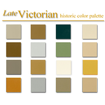
Early American Style
Colonial Amercians drew inspriation from their European heritage. Curent design styles would filter across the ocean and become reinventedin early America. Proportion and scale took reign over ornementation, A neutral color palette of grey blue, greens and rose pinks is readily apparent.
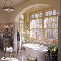
Stucco Rustico - Aged Plaster
Stucco Rustico is a Traditional interior and exterior textured plaster that epitomizes the rustic old world charm commonly associated with Tuscan environments. I love this treatment for its ease of application and the natural, organic glazed appearance that results when using mineral based plasters and glazes. Whether a rough application or a smooth finish, this treatment holds true to the test of time and, in fact, feels as if time itself stopped to wash the walls personally.
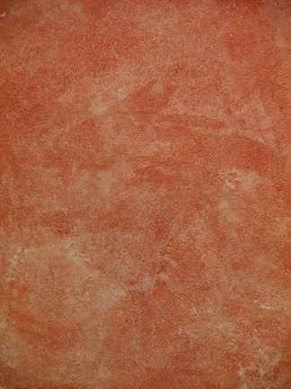
The Rustic Color Palette
The Rustic Style color palette falls within a distinct range of color tones and is essential in creating a successful Rustic interior. By using the appropriate color tones you can create a variety of design styles ranging from Period and Historic, regional or thematic. Color helps define our experiences within an interior and exterior environment. It affects us on a physical, emotional, and spiritual level and can be calming and passive, expressive and vital.
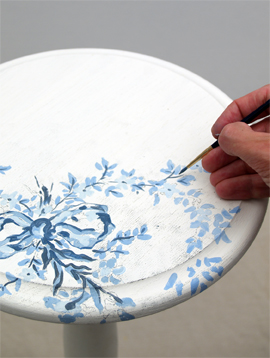
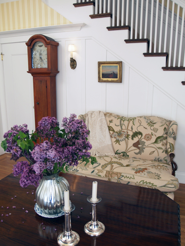
Painted Floral Details
Floral patterns used as accents in fabrics and furniture are common place details in the English Country home. These graceful and organic patterns complement the cozy interior of this style and work particularly well with lace window treatments, an heirloom tea service set and the natural and rustic charm of wooden ceiling beams and slightly irregularly textured walls.