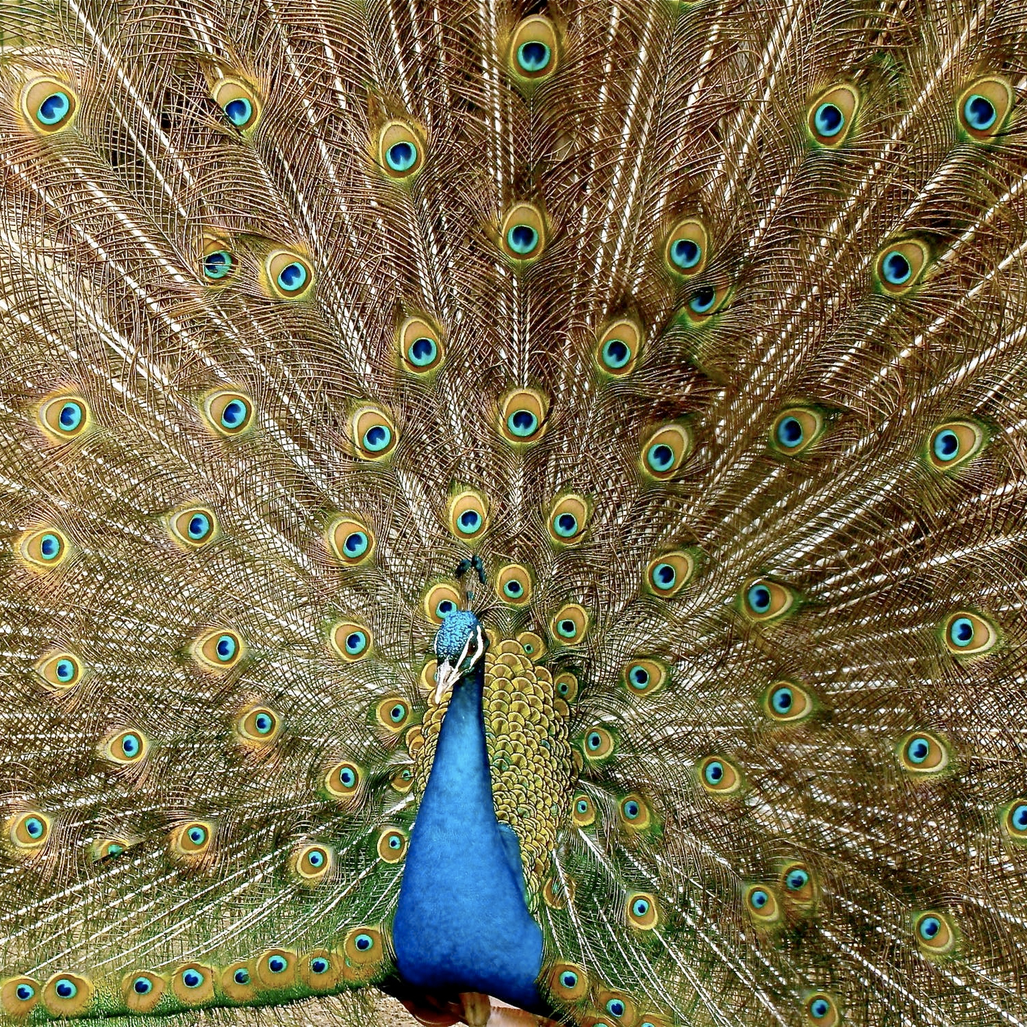
Using color at home or in the office—for paintings, furniture, or any artistic challenge—takes a good eye, a little know-how, and a creative imagination.
At artSparx we’ve developed a color program that will help you solve all your color challenges. Start by visiting the “Colors for residential and commercial interiors” feature for a clear overview of using color successfully in any environment. Next, browse the ColorScheme features to tailor and design a palette that fits your needs. From basic ideas on how we see color to the 3-step ColorScheme system created at artSparx, you’ll learn the elements of color—and how to turn them into practical, confident choices for any project.
Color Palette
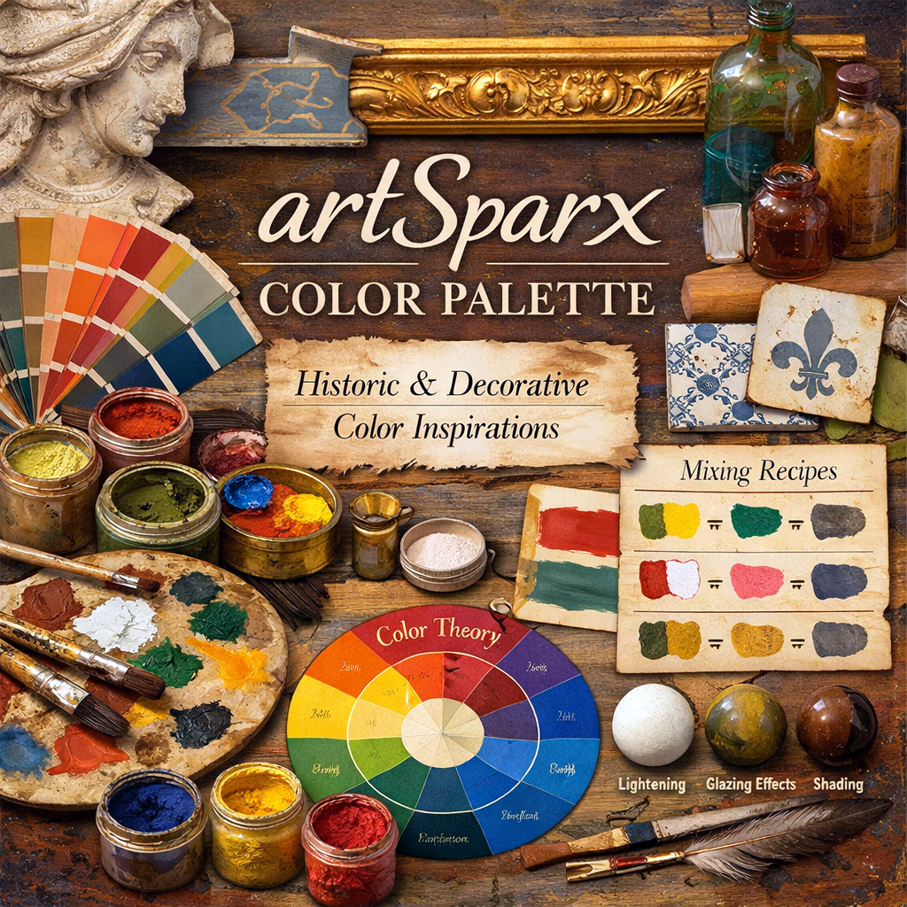
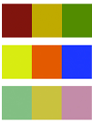
Color mixing recipes, ideas, and basic color principles to help you get started.
ColorSelect
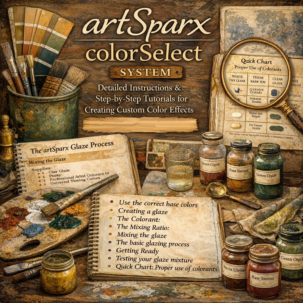
Create custom color effects in your home or office. Learn how to: choose the best base color, create a glaze, mix colors, and more.
ColorScheme
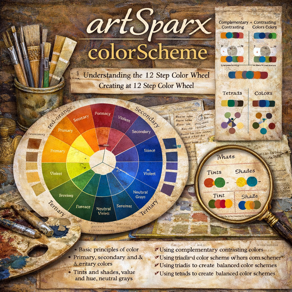
Understanding the 12-step color wheel—and how to build one.
Color Theory
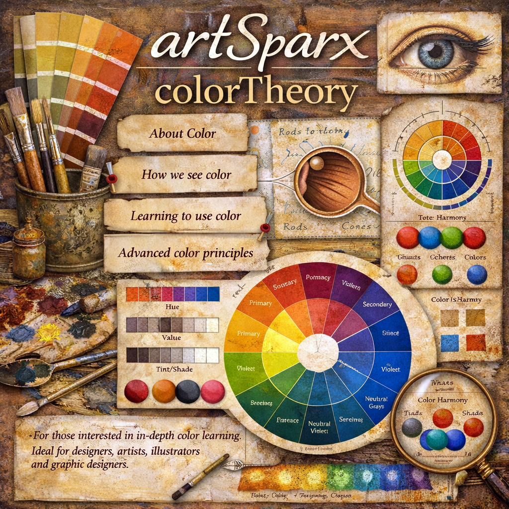
About color: how we see it, how to use it, and advanced principles.
Color Facts
Did you know? Vermillion color has been dated back to over 7000 years. Cinnabar, mined in Spain, became a luxury item among the Roman elite. And there’s more…
Historic Colors
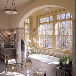
Neutrals and clarity of color. Federal Style introduces blues, greens, and soft rose colors, while Modern Design emphasizes greys, clean whites, and…
Inspired by the ornate plaster-work of Renaissance Italy, decorative plaster has a millennial history, with origins dating back to the Rome of the Caesars and the art of Ancient Greece.
It was Andrea Palladio, a famous Italian architect, who in the XVI century re-discovered it through his studies and re-proposed it in the splendid Venetian villas that are still to this day the distinguishing mark of his career. Stucco Veneziano is an aesthetic solution that, step by step, conquered Venice and Lombardy, then Italy, and finally Europe in the XVII century. Today, Venetian plaster (Stucco Veneziano) restores the splendor of a classic and prestigious finish.
Getting going with these premixed glazes. Select one of our pre-mixed glaze colors or create your own. We custom mix any color from all major paint manufacturers. Just pick your own color from any swatch book and let us know the paint name and number and we'll send you the right glaze - interior or exterior - custom matched to your liking.
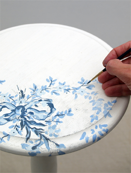
Create classic effects such as colorwashing, dragging, striee, antiquing effects, furniture effects and much more!
TIPS
Look for neutrals. Understanding a few simple color principles can result in successful color combinations for any project. Useful for interior design projects, decorative painting techniques, fine art painting, graphic design or illustration techniques, understanding color combinations can be easy and fun.
Look for compliments. When any one primary color is mixed with another a secondary color effect is produced. 3 secondary colors are produced from the mixing of one primary color with another. These colors are orange-green-violet. These secondary colors are also known as Secondary colors.
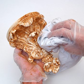
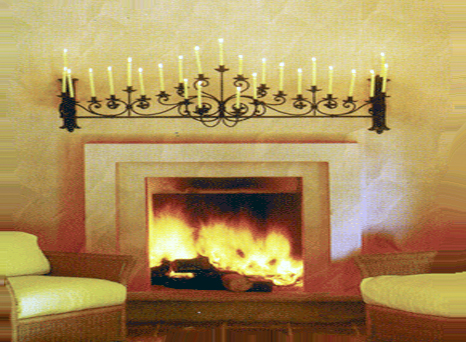
Antiquing For creating old world charm and sophistication.
Antiquing is the process of aging a surface to produce a time-worn appearance. There are many methods of antiquing, but I found that by mastering these few simple steps I’ve been able to successfully handle the antiquing of untold objects, furniture, mural paintings and wall surface finishing.
Working with Neutrals
Neutral colors primarily consist of a selection grays, beiges, tans, creams and taupe. These colors generally work with most other colors making them excellent choices as background colors for walls and ceilings. In this manner, more vibrant color choices can be executed in the interior in the form of fabrics, draperies and curtains, rugs and carpets, objects, furniture and accessories like throw-pillows, lamp shades and pictures or paintings.
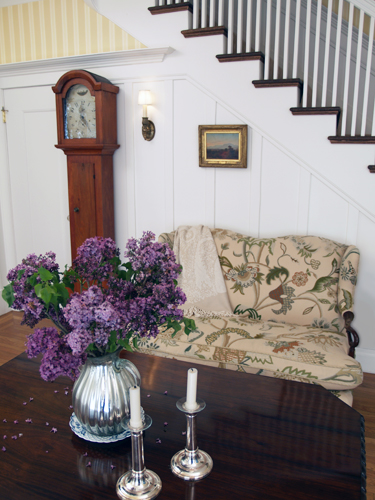
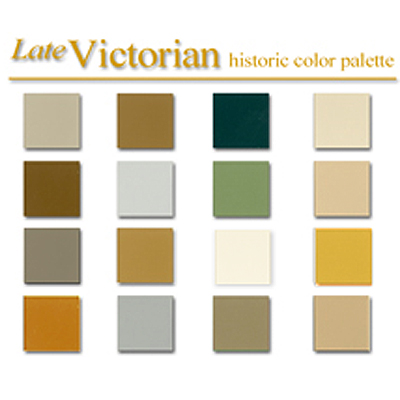
Colonial Amercians drew inspriation from their European heritage. Curent design styles would filter across the ocean and become reinventedin early America. Proportion and scale took reign over ornementation, A neutral color palette of grey blue, greens and rose pinks is readily apparent.
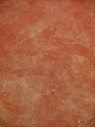
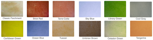
Stucco Rustico is a Traditional interior and exterior textured plaster that epitomizes the rustic old world charm commonly associated with Tuscan environments. I love this treatment for its ease of application and the natural, organic glazed appearance that results when using mineral based plasters and glazes. Whether a rough application or a smooth finish, this treatment holds true to the test of time and, in fact, feels as if time itself stopped to wash the walls personally.
The Rustic Style color palette falls within a distinct range of color tones and is essential in creating a successful Rustic interior. By using the appropriate color tones you can create a variety of design styles ranging from Period and Historic, regional or thematic. Color helps define our experiences within an interior and exterior environment. It affects us on a physical, emotional, and spiritual level and can be calming and passive, expressive and vital.
Floral patterns used as accents in fabrics and furniture are common place details in the English Country home. These graceful and organic patterns complement the cozy interior of this style and work particularly well with lace window treatments, an heirloom tea service set and the natural and rustic charm of wooden ceiling beams and slightly irregularly textured walls.