Distressed furniture has a quiet romance—an honest, worn beauty that suggests years of use, sunlight, and life. In the English Country tradition, pieces often feel collected rather than purchased, as if they have passed through hands and seasons and settled gently into the home. A simple bench, weathered by time, becomes the perfect canvas for this story: practical, welcoming, and full of charm.
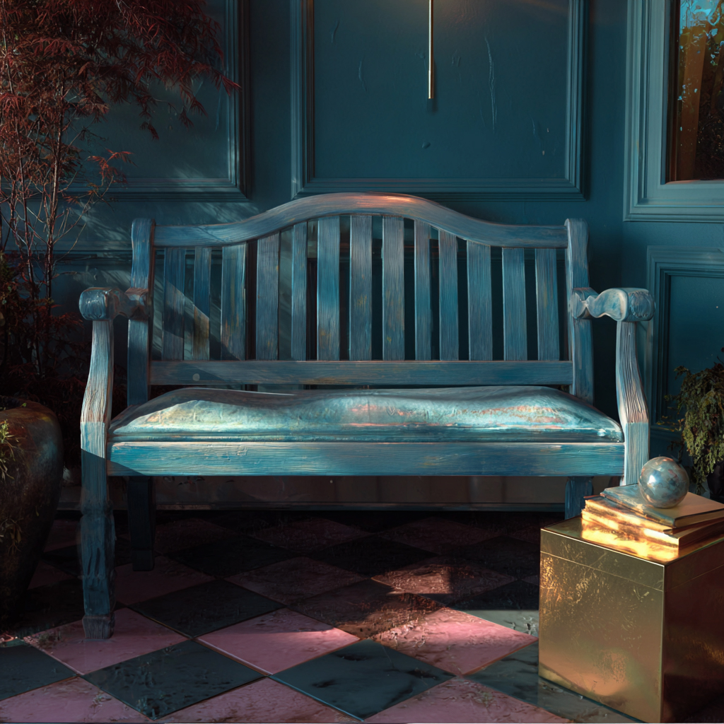
Through layers of paint, earlier colors emerge like small memories—glimpses of past days peeking through the present. The wax-resist method creates that familiar “painted over, rubbed back” character found on antique doors, garden furniture, and farmhouse pieces. The effect is both casual and composed: a comfy mismatch of history and harmony, once vibrant but now softened into an unassuming, almost forgotten presence. Neutral undertones of pale blues and greens sit beautifully beside rose lavenders and earthen browns, creating the gentle palette so often associated with English Country living.
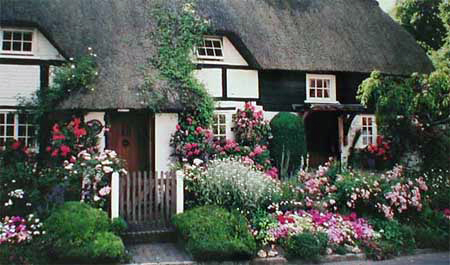
In the English countryside, pretty villages dot rolling hills and cobblestones line narrow medieval streets. Come in through the garden gate, and you'll find a steep thatched roof overhanging ancient leaded glass windows. Old garden roses creep around the carved oak door. The grounds, whether a picturesque cottage garden or the rolling parkland of the local manor house, are lovingly cared for. Everything is fresh, tidy, and welcoming.
English Country interiors reflect that same spirit—comfortable and lived-in, with layers of pattern, soft color, and timeworn finishes that feel collected rather than coordinated. Distressed furniture fits naturally into this world, providing warmth, texture, and a sense of gentle history without feeling fussy or overdone.
Color 1 – Rose Quartz

Color 2 – Sage Green

Color 3 – Dover Grey

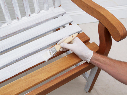
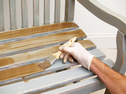
Begin by applying a loose coat of white latex primer. The primer establishes a clean base and helps later layers adhere evenly while keeping the final finish soft and luminous. Brushing in straight motions along the natural lines of the furniture supports an authentic, timeworn look and keeps the surface from feeling overly “painted.”
Once dry, lightly rub a Bees Wax stick onto the outside edges—areas such as arms, seat edges, and the top edge of the backrest. Wax is the secret to believable distressing: it creates protected zones where paint will not fully bond, allowing underlayers to reveal themselves later. This step should be applied sparingly, since additional wax will be introduced further along to build a more natural pattern of wear.
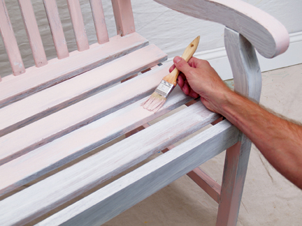
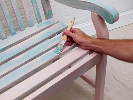
Apply Color 1, Rose Quartz, in a loose and irregular manner using a 1 inch brush. This layer is not meant to cover; instead it creates the impression of earlier color still living beneath the surface. Long, broad strokes feel truer to the way older pieces were often repainted—quickly, practically, and without perfection.
Allow small gaps and uneven transitions. Those “missing” areas become part of the visual history, giving later layers room to breathe and reveal the palette beneath.
Follow with Color 2, Sage Green, focusing on filling the voids left by Rose Quartz. Some overlap is not only acceptable—it is encouraged. Paint-over-paint creates richer depth and a more convincing aged surface, especially once the top coat is distressed back through the layers.
This stage sets the emotional tone of the finish: Sage Green introduces that garden softness so common to English Country pieces, hinting at quiet mornings, worn doors, and sun-faded paint.
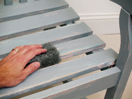
Add more wax in a random fashion, keeping in mind that waxed areas will become future “wear points.” Concentrate on edges of slats and raised details, as well as locations that naturally endure handling—arms, front seat edges, corners, and high-touch areas.
Vary the pressure and placement to avoid repeating patterns. The best distressing never looks planned; it feels as though time did the work on its own.
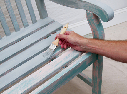
Apply the final layer, Color 3, Dover Grey, over the entire surface using a 2 inch brush. This coat unifies the piece and creates the muted, sophisticated exterior that defines the look. Be sure to reach edges and corners, allowing the top color to settle into the form.
Areas previously coated in wax may resist the paint slightly—this is exactly what helps create an authentic chipped and rubbed finish once the distressing begins.
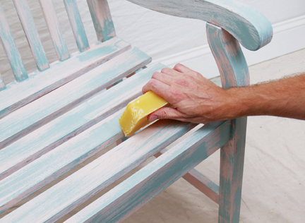
After the top coat has dried completely, remove wax and distress the surface using coarse steel wool. Work with the direction of the wood slats whenever possible. This stage reveals the earlier colors and, in places, may expose the white primer or bare wood—exactly the layered history that makes distressed furniture so appealing.
Control the look by varying pressure: lighter rubbing suggests gentle age, while heavier wear at edges and corners creates the honest impression of decades of use.
Finish with an antique glaze to deepen, unify, and soften the entire surface. This final wash subtly ages any crisp or exposed areas, blending transitions between colors and reinforcing the character of old chipped paint worn over time.
Mix Raw Umber and Burnt Umber with ¼ cup latex glazing liquid in a bucket. Add enough water to create a loose, fluid mixture. Apply liberally, then rub off, blot, and soften with a clean rag until the desired level of age and warmth is achieved. The glaze settles into corners and along edges, giving the piece that gentle shadowing found on true antiques.
Colonial Amercians drew inspriation from their European heritage. Curent design styles would filter across the ocean and become reinventedin early America. Proportion and scale took reign over ornementation, A neutral color palette of grey blue, greens and rose pinks is readily apparent.

Polished Plaster, or Stucco Veneziano, is a Traditional wall treatment that provides a glossy, visually textured wall finish. Venetian Plaster is a natural formula composed of organic ingredients, calcium, and acrylic binders creating a decorative paste plaster for interior applications. Polishing the surface compresses the calcium within the compound, creating a narble-like finish, cool and hard to the touch.
This treatment is quite versitile, ranging from a rustic backdrop to a refined and elegant finish.

The Rustic Style color palette falls within a distinct range of color tones and is essential in creating a successful Rustic interior. By using the appropriate color tones you can create a variety of design styles ranging from Period and Historic, regional or thematic. Color helps define our experiences within an interior and exterior environment. It affects us on a physical, emotional, and spiritual level and can be calming and passive, expressive and vital.
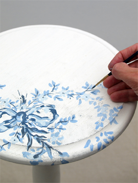
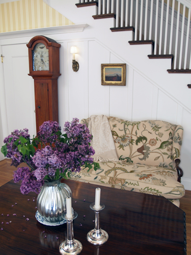
Floral patterns used as accents in fabrics and furniture are common place details in the English Country home. These graceful and organic patterns complement the cozy interior of this style and work particularly well with lace window treatments, an heirloom tea service set and the natural and rustic charm of wooden ceiling beams and slightly irregularly textured walls.